Color has to be one of the most important aspects of design. As designers we rely on color just as much as we rely on lines and shapes. Color can make or break a design. Color has meaning, we as humans associate color with different emotions. Imagine your self designing a logo for an energy drink and you use some down and depressing colors in your design you're bound not to get the gig. Try to imagine one of your favorite logos and change the color of it and see what emotions come to mind.
Here are some examples of color Psychology:


Knowing some of these different things about color can really improve your designs. You can find these same examples and more @ http://theultralinx.com/2014/04/psychology-colour-design-marketing-infographic.html
Now that we have a little bit of understanding of the psychology of color, what do we do with it? All designers need to have a basic understanding of color theory. We have to have an understanding of what colors go good together. What colors are aesthetically bound to each other. An example would be the classic black and white. These two colors are perfect together, but they are completely opposite. These two colors together are responsible for some of the simplest, and some the coolest designs out there. It is widely used in negative space designs.
The best way to get better at this is to know the color wheel. We need to know our primary and secondary colors. Here is a chart that will help you learn the color wheel.

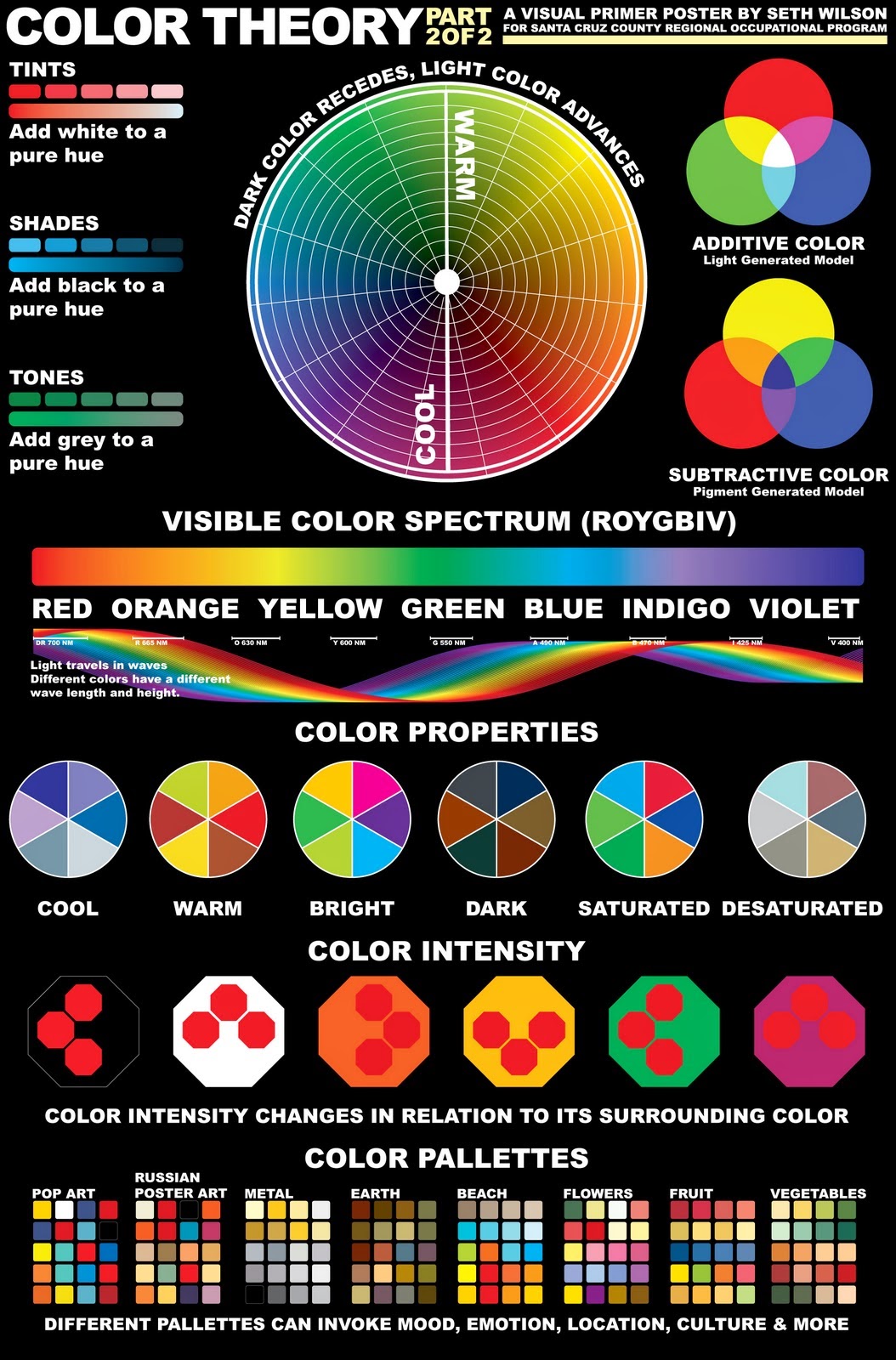
You can find these charts and more @http://inkfumes.blogspot.com/